Macot Design • Brand Identity
epoint
Client:
epoint
Category:
Macot Design • Brand Identity
Year:
2026
Agency:
Re Studio
I was responsible for the entire design process.
I was responsible for the entire design process.

Project Overview
Project Overview
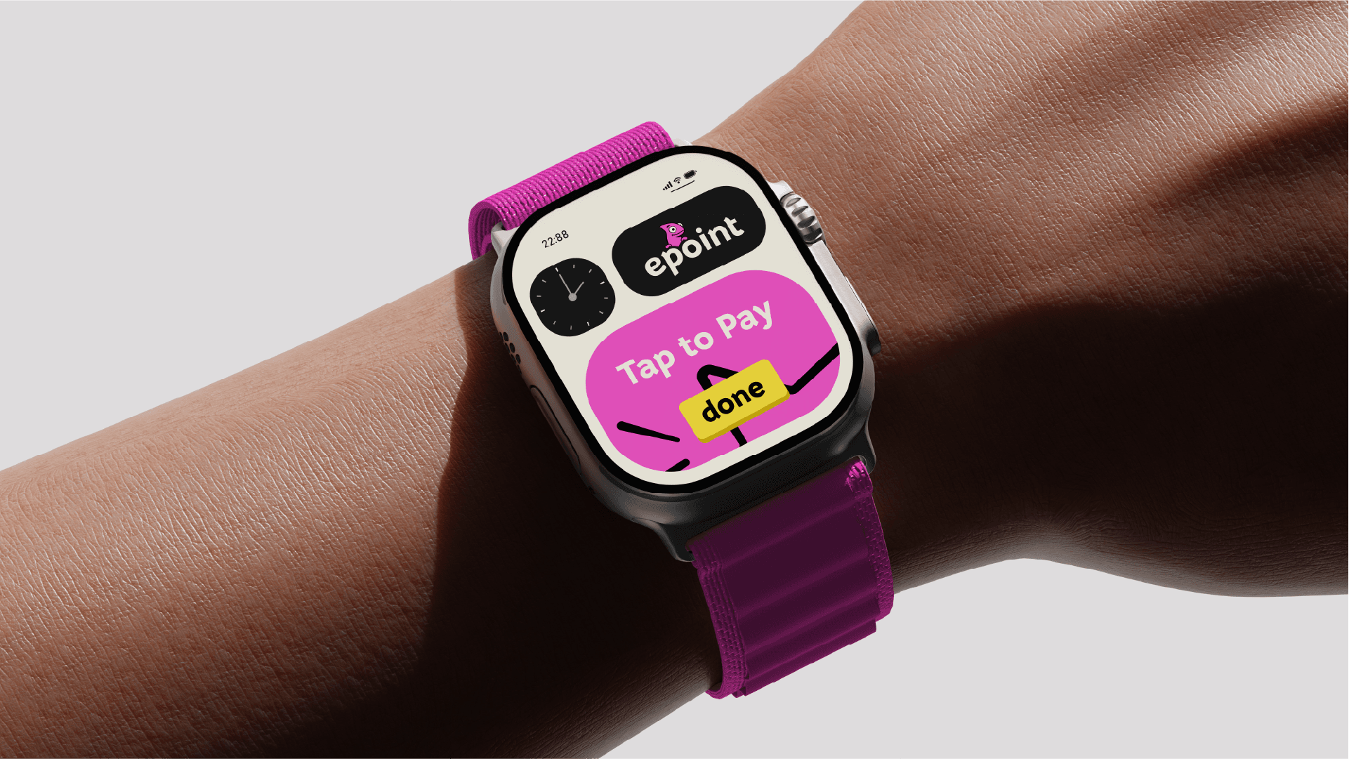
Epoint is a secure payment platform for businesses. Financial technology usually feels very rigid. I developed a complete brand identity to make this platform feel approachable. The visual system combines bold typography, a bright pink color palette, and a custom chameleon mascot. The chameleon represents flexibility and easy integration. Rather than focusing just on a logo, all these design elements work together. They create a lively brand presence that makes handling daily payments feel entirely stress free.
Epoint is a secure payment platform for businesses. Financial technology usually feels very rigid. I developed a complete brand identity to make this platform feel approachable. The visual system combines bold typography, a bright pink color palette, and a custom chameleon mascot. The chameleon represents flexibility and easy integration. Rather than focusing just on a logo, all these design elements work together. They create a lively brand presence that makes handling daily payments feel entirely stress free.
Epoint is a secure payment platform for businesses. Financial technology usually feels very rigid. I developed a complete brand identity to make this platform feel approachable. The visual system combines bold typography, a bright pink color palette, and a custom chameleon mascot. The chameleon represents flexibility and easy integration. Rather than focusing just on a logo, all these design elements work together. They create a lively brand presence that makes handling daily payments feel entirely stress free.